Designing with color. Tips & inspiration.
Color is a tricky beast, especially when choosing a color palette to represent your brand. It’s something that you’ll have to live with for a while, especially if you’re designing a logo and creating the digital assets and collateral for your business. In this post, I’ll share some basics about color theory, some tips when designing with color, resources for choosing color, and we’ll round it out with some palettes to inspire you.
There are two things I want to emphasize as you choose the color palette for your brand. Firstly, color says alot about the personality of your brand, so take the time to consider what your color choice says and make sure it aligns with your other visual (especially your logo) and verbal assets as well as the overall strategy for your brand. Secondly, be consistent. Once you choose your design color palette, stick with it. Note all the color codes for your palette (Hex, RGB, CMYK) so that you can apply them uniformly across all your platforms. In other words, don’t just guess because all blues are not alike!
Color Theory
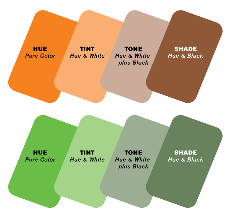
We don’t need to get into depth here, but a basic understanding of how people perceive color and how they mix and match with each other can be helpful! Hue, value, and chroma are the three building blocks of color and knowing the power of complementary and analogous colors is also helpful. Let’s define each.
Hue Pure color as found on the color wheel – there are limited hues.
Tint The hue mixed with white in order to lighten a color.
Tone The hue mixed with grey or varying degrees of black and white.
Shade The hue mixed with black in order to darken a color.
Complementary color Two colors on the opposite ends of the color wheel.
Analogous color Colors that sit next to each other on the color wheel.
Color Wheel: Vecteezy.
Saturation The intensity or purity of the color.
Luminance The amount of brightness or light in a color.
For an indepth look at color theory and design, check out this article.
Color Choice
When choosing colors you can think about whether you want to chose bright, saturated colors or more muted colors depending upon your business’ personality. For example a spa might choose a softer, tonal palette, whereas a preschool might choose bolder colors. You can also decide to gravitate to warm colors like red, orange, yellow, or cooler colors like purple, blue, green. It’s particularly interesting and sophisticated to mix a bright hue with its tinted or shaded complementary color.
Another way to choose colors is use the 60–30–10 rule. Choose a base color, often a neutral, for 60% of the design. Then choose a secondary color for 30% of your design, a mid-tone color that acts as a bridge, and then an accent that is used for 10% of the design often a bright color that adds a bit of pop.
Color Psychology
Humans often associate colors with emotions but bear in mind this shifts with culture. Common western color associations include:
Blue Integrity, Trust, Tranquility, Loyalty, Intelligence
Green Money, Growth, Freshness, Environmental-Friendliness
Yellow Happiness, Originality, Energy
Purple Royalty, Spirituality, Luxury
Pink Femininity, Compassion, Playfulness
Red Power, Strength, Passion
Orange Courage, Originality, Success
White Cleanliness, Purity, Freshness
Black Elegance, Drama, Strength
Tips
When choosing colors ask yourself these key questions:
What palette expresses the personality of my brand?
Where will these colors be used? Digital media, print, signage all have to be carefully considered.
At what size will will each of my colors be used?
What will the background be – dark, medium, or light in tone? It’s important to consider contrast and legibility.
Do I want a bright, muted, or mixed palette?
What do I want to connote with my color choice?
Are my color choices trendy right now? Will they look dated in 5 years?
Do I need to factor in color blindness?
Resources
There are fantastic resources out there if you want to get inspired or just play around with color. Here are a few we find helpful, all of which are free!
You can also just search “color Palette” on Google or Pinterest for lots of inspiration or look to nature, flowers and plants have amazingly beautiful colors that are incredibly pleasing to the eye!
Color Inspiration
We’ve created a few palettes to inspire you. Each palette includes a dark neutral for text (text does not always have to be the default black) and a light background color. In addition, we like to include an accent color that pops – either it’s the most saturated color or perhaps a complementary hue.
Hope this posts helps inspire you to create a fun color palette for your brand!
Happy coloring!


